

La aplicación de efectos de portada avanzados es el método principal para evitar la trampa del bajo margen de un mercado saturado de impresión bajo demanda.. Depender únicamente de la impresión CMYK básica deja su libro para colorear enterrado entre miles de listados digitales planos, limitar los precios minoristas y limitar severamente las conversiones en los estantes físicos.
Este análisis compara las mejoras de acabado premium con las estándar. 10 a 12 tiradas de cartón pt. Evaluamos las limitaciones exactas del material de la laminación suave al tacto en 250 a 350 tableros de arte gsm y aplicaciones UV puntuales de alto contraste para ayudarle a asegurar una presencia escalable en los estantes.
Elementos clave de la portada de un libro para colorear de alta conversión
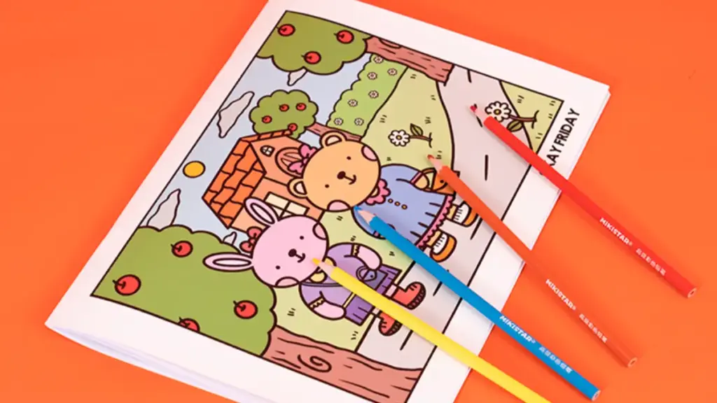
La portada de un libro para colorear de alta conversión equilibra la estricta jerarquía de títulos, estilo de ilustración enfocada, y una marca consistente para captar la atención del comprador al instante en los mercados físicos y digitales..
Jerarquía de títulos y diseño de tipografía
La tipografía de tu portada debe funcionar como un gancho visual inmediato.. Los compradores que navegan por los mercados digitales necesitan leer y comprender el valor del libro en una fracción de segundo..
- Escala y ubicación: Forzar que el título principal ocupe entre el 25% y el 40% del ancho visual. Colóquelo en el centro muerto o en el centro superior., y mantenga estrictamente un margen seguro de 0,25 pulgadas.
- Peso de los subtítulos: Establezca el subtítulo entre el 50% y el 70% del peso visual del título principal para que respalde el gancho principal sin competir por la atención..
- Coincidencia demográfica: Aplique serifas relajantes para libros para adultos que alivien el estrés y use sans-serifs redondeadas con un seguimiento más flexible para títulos para niños..
- Restricciones de contraste: Limite la tipografía a una fuente primaria y una secundaria para garantizar un alto contraste de brillo con el fondo..
- Legibilidad de la plataforma: Verifique que el texto permanezca nítido y legible a una altura de 100 a 150 píxeles para cumplir 2026 Estándares de visualización para dispositivos móviles y comercio electrónico.
- Optimización de alineación: Centre ópticamente el tipo contra formas sólidas de respaldo para separar las formas de letras de las ilustraciones de fondo detalladas..
Estilo de ilustración y enfoque visual
Las ilustraciones de la portada actúan como una promesa enfocada del contenido interior.. Las obras de arte abarrotadas diluyen el mensaje central y alejan a los compradores potenciales.
- Especificaciones de carrera: Aplique pesos de trazo nítidos de 0,5 a 1 pt para diseños para adultos. Usar más grueso, contornos más atrevidos para los formatos infantiles para indicar que es más fácil colorear.
- Aplicación de color: Utilice combinaciones de colores planos o líneas artísticas.. Evite el sombreado en escala de grises, lo que entra en conflicto con la expectativa de color de las páginas interiores.
- Estrategia de punto focal: Anclar la portada con un único tema visual dominante en lugar de un collage denso..
- Separación de sujetos: Separe el sujeto principal del fondo utilizando una mayor saturación de color y dispositivos de encuadre claros..
- Restricción de paleta: Restrinja el diseño a 1 o 3 colores principales y exactamente 2 Colores de acento para gestionar la complejidad visual.. Si todavía estás conceptualizando tu línea de productos, explore nuestra guía completa sobre ideas de libros para colorear personalizados para combinar temas de tendencia con diseños de diseño rentables.
- Vistas previas interiores: Característica 2–4 de alta resolución, Imágenes nítidas de vista previa del interior en la contraportada para validar la calidad del interior para compradores indecisos..
Identidad de marca y alineación del público objetivo
Una marca consistente genera confianza y asegura compras repetidas en múltiples volúmenes. Cada decisión visual debe alinearse directamente con las expectativas psicológicas del comprador..
- Orientación por segmentos: Haga coincidir el color y el motivo con el grupo demográfico. Utilice tonos fríos apagados para aliviar el estrés de los adultos, colores primarios brillantes para edades tempranas de la escuela, y marcadores de género claros para nichos estacionales.
- Consistencia de la serie: Mantener diseños fijos para las fuentes de los títulos., colocaciones de logotipos, y bandas en el lomo en todos los volúmenes de la serie para asegurar una fuerte presencia física en los estantes.
- Copia de contraportada: Incluir un corto, Anuncio orientado a los beneficios en la contraportada que explica rápidamente lo que el usuario logrará o experimentará..
- Cumplimiento técnico: Verifique que todas las plantillas de diseño cumplan estrictamente 2026 Especificaciones de márgenes y sangrado de la plataforma de impresión para evitar errores críticos de producción.
Opciones de materiales de portada para libros para colorear
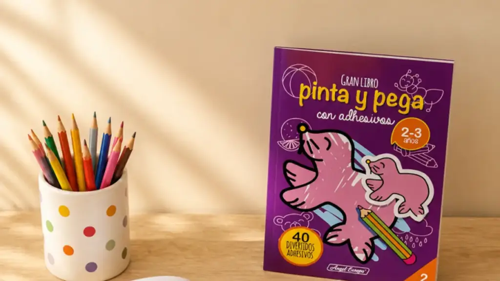
Libro para colorear las cubiertas deben equilibrar la durabilidad con el atractivo táctil. Elija cartón estándar para tiradas digitales, tablero de arte pesado para ediciones premium, o sintéticos para uso intensivo en el aula.
Especificaciones de sustratos centrales y cartón
La selección del material base adecuado determina el rendimiento del libro en el lineal y en manos del usuario..
- Cartón estándar: 80–Cubierta de 100 libras (10–12 puntos C1S/C2S) maneja la encuadernación perfecta fácilmente y se adapta a tiradas cortas digitales y plataformas de impresión bajo demanda.
- Culatas de cobertura pesada: 250–El cartón artístico revestido de 350 g/m² proporciona rigidez para las ediciones de regalo boutique y admite grabados profundos o láminas multicapa..
- Acciones recicladas ecológicas: Muestre fibras naturales visibles y combínelas de forma segura con recubrimientos acuosos a base de agua en lugar de películas plásticas..
- Materiales sintéticos: El polipropileno ofrece una gran resistencia a la humedad y al desgarro para los cuadernos de actividades en el aula o al aire libre..
Tratamientos Superficiales y Acabados Táctiles
El revestimiento exterior protege el sustrato y al mismo tiempo indica el posicionamiento exacto en el mercado a su comprador objetivo..
- Laminación brillante: Proporciona una alta resistencia a los rayones y una saturación de colores vibrantes para las ediciones infantiles del mercado masivo..
- Laminaciones mate y de tacto suave: Crea una sensación premium para títulos para adultos. Los acabados de terciopelo requieren un tablero más pesado de 250 a 350 g/m2 para evitar deformaciones..
- Estampado puntual de láminas metálicas y UV: Genere un marcado contraste visual sobre la laminación mate para enfatizar la tipografía y el arte lineal intrincado..
- Restricciones de bisagra: Las impresoras restringen las aplicaciones de estampado pesado y láminas cerca del canal de las bisagras para evitar grietas estructurales en los lomos encuadernados perfectamente..
Libros para colorear personalizados para el aprendizaje temprano a escala
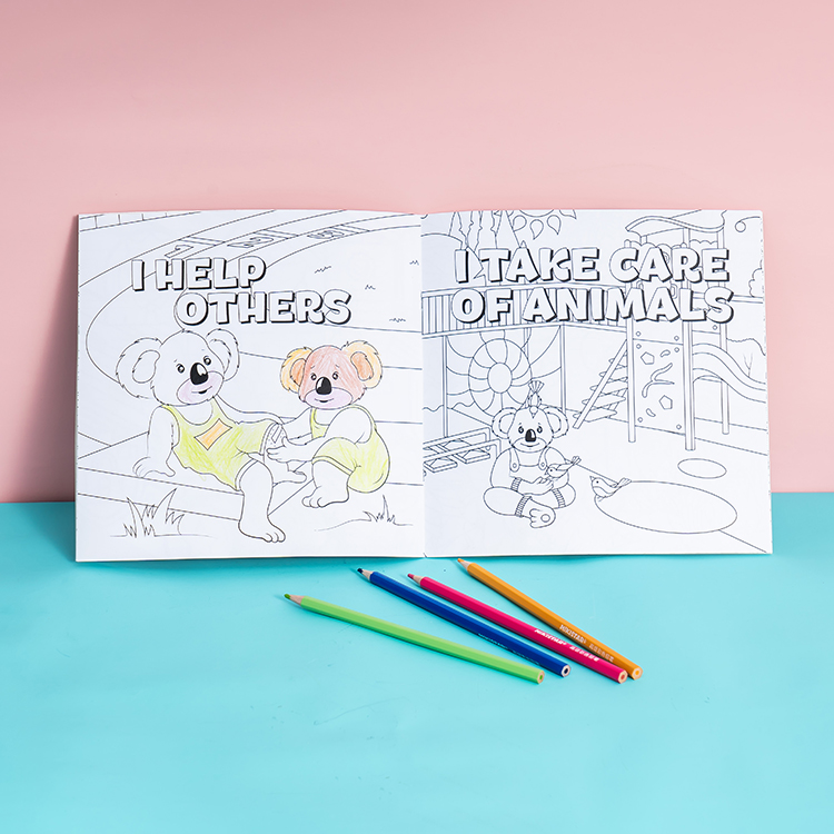
De primera calidad Opciones de acabado de portada para libros para colorear
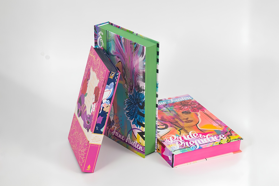
El acabado avanzado convierte un libro para colorear estándar en uno premium, producto para regalar. Opciones como Spot UV, frustrar, y la laminación suave al tacto mejoran la interacción táctil y justifican precios minoristas más altos.
| Opción de acabado | Efecto primario | Aplicación ideal |
|---|---|---|
| Punto UV | Alto brillo, aspecto húmedo sobre áreas específicas | Resaltando títulos, logotipos, y motivos clave |
| Estampado de láminas | Brillo reflectante metálico u holográfico. | Ediciones de coleccionista y marcas premium |
| Estampado/grabado | Relieve 3D elevado o textura empotrada | Retroalimentación sensorial para temas de atención plena |
| Laminación suave al tacto | Aterciopelado, engomado, acabado de bajo brillo | Protección general de la cubierta y base de contraste. |
Spot UV para resaltar elementos clave de diseño
Spot UV aplica un claro, Recubrimiento líquido curado con UV en áreas de cobertura específicas para crear un alto brillo, mirada mojada. Este revestimiento contrasta marcadamente con los laminados mate o suaves al tacto para crear títulos., nombres de autores, y los motivos ilustrativos clave destacan instantáneamente en el estante.
- Especificaciones de preimpresión: Requiere ilustraciones vectoriales de alta resolución con un 100% máscara negra en una capa separada para un registro preciso de la impresora.
- Protección de superficies: Agrega resistencia específica al desgaste y crea superficies que se pueden limpiar con un paño en partes de la cubierta que se manipulan con frecuencia..
Estampado de láminas (Oro, Plata, y efectos holográficos)
El estampado de lámina transfiere lámina metálica o pigmentada a la cubierta mediante calor., presión, y un troquel de metal personalizado. Esta aplicación señala una prima., producto para regalar, Brindar a los editores la ventaja visual para validar precios minoristas más altos para ediciones especiales o de colección..
- Variantes visuales: Presenta metales estándar como oro y plata., Colores especializados como el oro rosa., y películas holográficas que cambian de color con el ángulo de visión.
- Restricciones materiales: Se adhiere mejor a materiales recubiertos con laminación, pero los diseñadores deben evitar líneas extremadamente finas o letras invertidas para evitar que se descascaren..
Estampado y grabado en relieve para textura táctil
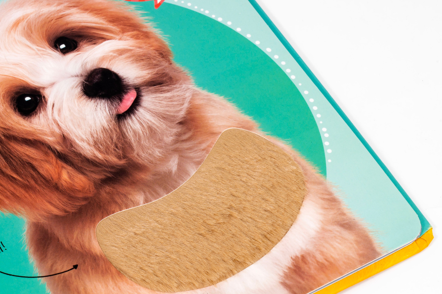
Esta técnica plantea elementos de diseño para crear un relieve 3D. (realce) o los presiona hacia abajo en la cubierta (grabado). Proporciona fisico, retroalimentación sensorial que complementa perfectamente los temas de atención plena y relajación centrales en los libros para colorear para adultos.
- Especificaciones del papel: Combina bien con cartulinas para cubiertas más pesadas de 250 a 350 g/m² para mantener el relieve profundo sin rasgar el papel..
- Capacidades de capas: Combina maravillosamente con estampado de papel de aluminio para crear texturas., títulos metálicos o bordes de marcos intrincados alrededor de las ilustraciones centrales.
Laminación suave al tacto para una sensación premium
La laminación suave al tacto cubre la cubierta con una fina película que añade un toque aterciopelado., textura engomada y un sofisticado, apariencia de poco brillo. Este acabado potencia el efecto calmante., Experiencia táctil para compradores justo en el punto de venta., Animándolos a levantar y sostener el libro..
- Perfil de durabilidad: Protege la obra de arte contra rasguños., desgastes, y borrado de tinta durante el transporte y el uso diario intenso.
- Utilidad de capa base: Sirve como capa base ideal para Spot UV y estampado de láminas., maximizar el contraste visual contra el fondo apagado.
Técnicas creativas de portada para diseños interactivos
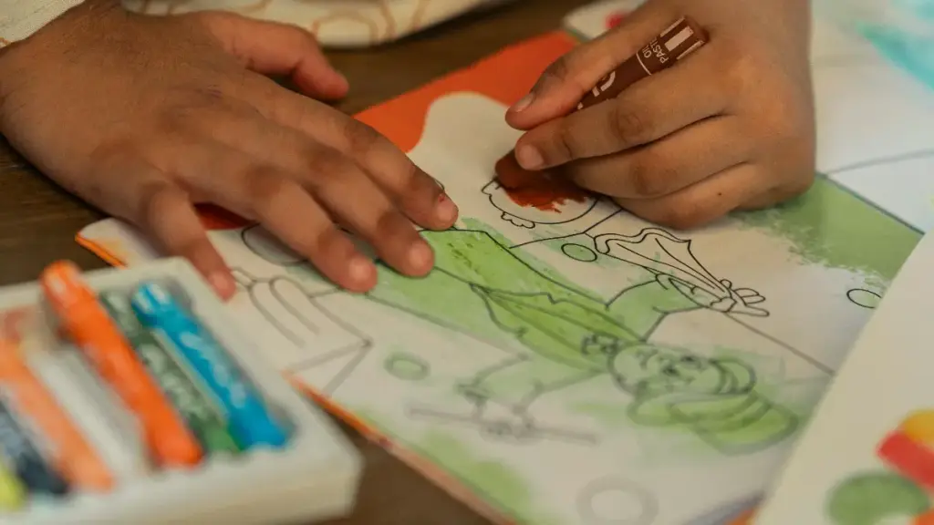
Una portada interactiva debe señalar instantáneamente su propósito y funcionalidad.. Utilice puntos focales fuertes, alto contraste, y movimiento sutil para guiar el comportamiento del usuario antes de interactuar con el contenido principal.
Estrategias de composición y diseño visual
La primera pantalla que ven los usuarios establece la base visual y emocional para toda la experiencia interactiva.. Para lograr un impacto inmediato, necesitas un marco visual muy intencionado que priorice la claridad sobre la decoración.
- Puntos focales fuertes: Fije la atención del usuario en un único elemento dominante mediante diseños centralizados o la regla de los tercios..
- Imágenes simbólicas: Confíe en iconos y formas abstractas en lugar de complejas, escenas literales. Este enfoque acelera la comprensión y garantiza que el diseño se escale limpiamente en múltiples dispositivos..
- Alto contraste: Aplique variaciones intensas de color y luz para separar los controles interactivos de primer plano de los suaves., fondos simplificados.
- Jerarquía tipográfica: Cíñete a familias de fuentes mínimas. Debe asegurarse de que los títulos sigan siendo muy legibles cuando se los somete a efectos de desplazamiento., animaciones, y escalado responsivo.
Capas avanzadas de movimiento e interacción
Las imágenes estáticas solo te llevan hasta cierto punto en un entorno interactivo.. Necesita movimiento para decirles a los usuarios qué pueden hacer y cómo responderá el sistema.. Cuando se ejecuta correctamente, Estas capas construyen un puente entre la impresión inicial y la aplicación principal..
- Microinteracciones sutiles: Integrar ligeros aumentos de escala., cambios de sombra, o íconos pulsantes para mostrar inmediatamente a los usuarios con qué elementos pueden interactuar.
- movimiento narrativo: Guíe la vista del usuario exactamente hacia donde desea antes de que actúe mediante animaciones cronometradas, como títulos deslizantes o rutas autodibujadas..
- Ilusiones de profundidad: Cree efectos de paralaje en capas que separen las llamadas a la acción en primer plano de los objetos intermedios y los fondos abstractos..
- Divulgaciones progresivas: Diseñe las interacciones iniciales del usuario para transformar perfectamente la pantalla de portada en el diseño de la aplicación principal..
Cuándo utilizar el acabado premium frente a la impresión de portadas estándar
Utilice acabados premium para señalar lujo, aumentar el compromiso táctil, y proteger piezas de marketing de alto valor. Cíñete a la impresión estándar para grandes volúmenes, sensible a los costos, grabable, o materiales informativos de rápida entrega..
| Factor de comparación | Impresión de portada estándar | Actualizaciones de acabado premium |
|---|---|---|
| Mejor para | Alto volumen, mercado masivo consciente del presupuesto & niños’ libros. | marca de lujo, ediciones de coleccionista & títulos premium para adultos. |
| Especificaciones de materiales | 80–Cubierta de 100 libras (10–Cartón C1S/C2S de 12 puntos). | Tableros artísticos recubiertos de 250 a 350 g/m² de peso pesado. |
| Efecto táctil | Superficie plana con revestimiento CMYK mate o brillante estándar. | 3Contraste D mediante película suave al tacto, Spot UV, o lámina metálica. |
| Escribibilidad | Alto; las áreas sin recubrimiento aceptan fácilmente medios colorantes. | Bajo; la capa laminada sellada requiere marcadores permanentes. |
| Velocidad de producción | Rápido; Impresión de una sola pasada y preparación de archivos optimizada.. | Moderado; requiere configuración de máscara multicapa y troqueles personalizados. |
| Economía unitaria | Costo unitario ultrabajo; ideal para modelos POD de bajo margen. | Mayor costo de instalación; escala a granel para impulsar precios superiores. |
Pensamientos finales
Aunque genérico, Las portadas de impresión bajo demanda mantienen bajos los costos de producción iniciales., no logran asegurar un posicionamiento minorista premium. Las inversiones estratégicas en tableros de arte más pesados y acabados táctiles, como laminación suave al tacto y UV puntual, son las únicas formas confiables de obtener mayores márgenes y dominar los estantes saturados.. Su elección del acabado de la cubierta dicta directamente el valor percibido del producto en su interior., impactando directamente su general costo del libro para colorear y retorno de la inversión a largo plazo.
Deje de adivinar la calidad del material y verifique sus actualizaciones táctiles antes de escalar su próxima tirada de impresión.. Recomendamos solicitar un paquete de muestra física para evaluar de primera mano nuestros estampados de láminas personalizados y laminaciones suaves al tacto.. Contacta con nuestro equipo para alinear sus especificaciones de preimpresión y asegurar el precio de sus pedidos al por mayor.
Preguntas frecuentes
¿Cuáles son los mejores efectos de portada para libros para colorear premium??
Combine laminación suave al tacto con brillo UV puntual, lámina metálica, o estampado 3D. Para impresión bajo demanda, Utilice gráficos digitales de alto contraste para simular estas texturas premium..
¿El estampado de papel de aluminio funciona en laminación suave al tacto??
Sí. Los grados de láminas especiales se adhieren perfectamente a películas suaves al tacto bajo temperatura y presión precisas., creando líneas metálicas nítidas que contrastan con el fondo aterciopelado.
¿Cómo se agrega textura a la portada de un libro para colorear??
Digitalmente, superponga patrones de papel o lino usando los modos de fusión Multiplicar. Físicamente, utilizar películas suaves al tacto, brillo UV de punto elevado, o estampado mecánico para crear profundidad táctil.
¿La luz ultravioleta puntual es costosa para pedidos al por mayor??
No. Si bien la configuración y calibración iniciales requieren una inversión inicial, El costo unitario cae significativamente a escala., lo que lo hace altamente rentable para grandes tiradas compensadas.
¿Qué es la laminación suave al tacto??
Es una película de plástico BOPP de primera calidad unida térmicamente a la cubierta.. Proporciona un aterciopelado, Textura mate que ofrece protección contra rayones y humedad..
¿Cómo se diseña una portada impresa con efectos especiales??
Utilice líneas de corte estándar y separe su obra de arte en capas.. Crea máscaras de efectos usando 100% formas vectoriales negras, mantenga los gráficos alejados del lomo, y solicitar pruebas.