Seu brochura a capa é o primeiro ponto de contato entre o seu produto e o mercado. Além da proteção básica, funciona como uma ferramenta de conversão crítica, especialmente em ambientes de varejo e comércio eletrônico, onde os leitores normalmente tomam uma decisão dentro de 3 a 5 segundos após verem a capa.
Em categorias altamente saturadas, dados de produção mostram que livros com acabamentos de capa aprimorados (como laminação, UV, ou estampagem de folha) pode atingir taxas de engajamento 15–30% mais altas em comparação com coberturas padrão não revestidas. A razão é simples: acabamento influencia diretamente no valor percebido, experiência tátil, e posicionamento da marca.
No entanto, nem todos os acabamentos têm o mesmo propósito. A laminação brilhante melhora a vibração da cor e a resistência à umidade, enquanto os acabamentos foscos oferecem um acabamento mais premium, estética moderada. Opções especiais, como efeitos holográficos ou em relevo, podem diferenciar ainda mais seu produto, mas também impactar o custo, tempo de espera, e escalabilidade.
Abaixo, nós quebramos 8 acabamentos essenciais de capa de brochura, ajudando você a avaliar cada opção com base no impacto visual, durabilidade, e eficiência de produção, para que você possa tomar uma decisão comercialmente correta para sua próxima tiragem.
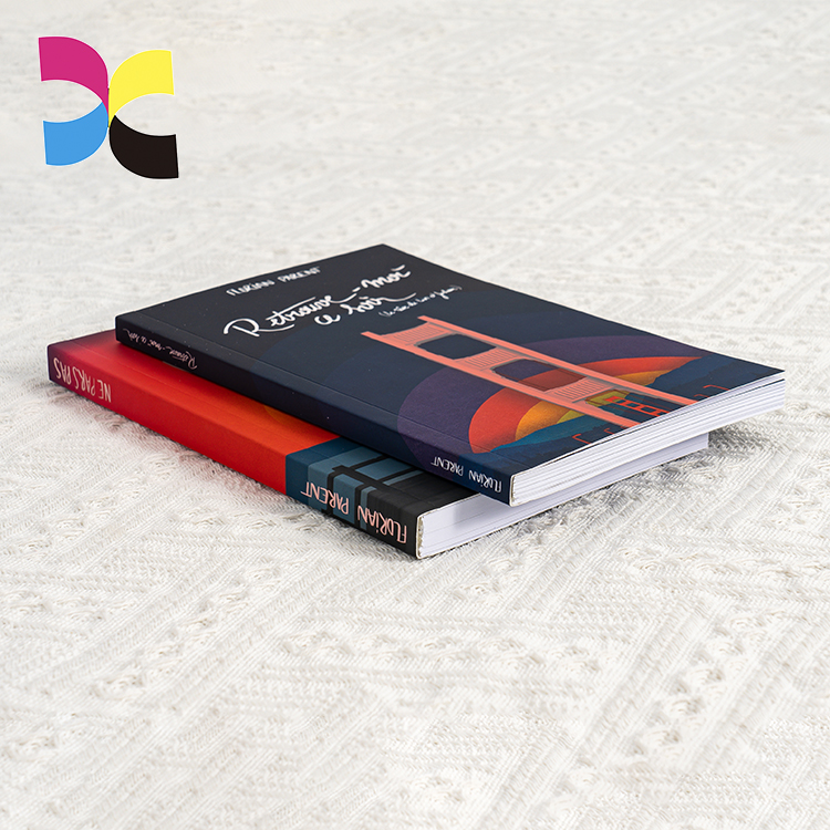
Tabela de comparação rápida: Acabamentos de capa de brochura
| Acabamento da capa | Efeito | Nível de custo relativo |
| Laminação brilhante | Durabilidade diária + brilhar | Baixo |
| Laminação fosca + Spot UV no título | Um suave, sensação elegante | Médio |
| Cor exata Pantone | Seu logotipo para permanecer perfeitamente na marca | Médio |
| Gravação ou estampagem em folha | Um tátil, título luxuoso | Alto |
| Folha holográfica ou acabamento | Um dramático, efeito de captura de luz | Alto |
| Bordas coloridas ou impressas | Um elemento surpresa (livro fechado) | Médio-Alto |
Verniz Brilhante vs.. Laminação (Matte / Lustro / Toque suave)
Antes de passar para acabamentos especiais, é essencial compreender as duas camadas protetoras mais utilizadas na produção de brochuras: verniz e laminação. Embora ambos melhorem a aparência, seu desempenho em durabilidade e experiência do usuário difere significativamente.
| Tipo | Aparência | Durabilidade | Melhor para |
| Verniz Brilhante | Brilhante, reflexivo | Baixo-Médio | Projetos de curto prazo, empregos sensíveis ao custo |
| Laminação Brilhante | Alto brilho, suave | Alto (resistente à água) | Livros de receitas, livros infantis, títulos com muitas fotos |
| Laminação fosca | Não reflexivo, elegante | Alto (resistente a riscos) | Ficção literária, publicações corporativas |
| Laminação de toque suave | Aveludado, semelhante a borracha | Alto | Edições Premium, Livros de presentes |
Se espera-se que seu livro circule com frequência – seja no varejo, bibliotecas, ou eventos – a laminação não é apenas uma atualização, é a escolha mais segura a longo prazo. Do ponto de vista da produção, a laminação proporciona um aumento de 40 a 60% na durabilidade da superfície em comparação com o verniz padrão, particularmente na resistência à umidade, abrasão, e manuseio repetido. É por isso que acabou 70% dos livros de bolso distribuídos comercialmente agora usam alguma forma de laminação como acabamento de base.
Verniz, por outro lado, continua sendo uma opção prática para produtos ou projetos de ciclo de vida curto onde o controle de custos é a prioridade - mas tende a apresentar desgaste (arranhando, desbotamento da borda) após uso limitado.
Impressão CMYK
A impressão CMYK em cores continua sendo a base da indústria para capas modernas em formato brochura. Combinando quatro tintas de processo(Ciano, Magenta, Amarelo, e preto). Ele pode reproduzir mais 16 milhões de variações de cores, tornando-o altamente versátil para a maioria dos projetos comerciais.
- Melhor para: Capas ilustradas, fotografia, gradientes complexos, e layouts ricos em cores onde a profundidade visual e a precisão são importantes.
- Limitações: O CMYK padrão não consegue reproduzir neon com precisão, fluorescente, ou efeitos metálicos. Normalmente exigem cores especiais ou acabamentos especiais, como folha ou UV.
- Eficiência de custos: CMYK é geralmente a opção mais econômica para produção em cores, especialmente na impressão offset, onde é responsável por 80-90% dos trabalhos de capa brochura devido à sua escalabilidade e consistência.
Se a sua capa depende de imagens detalhadas ou transições de cores em camadas, CMYK não é apenas um ponto de partida. É o padrão de produção padrão que equilibra a qualidade, eficiência, e custo.
Impressão Pantone
O sistema de correspondência Pantone (TPM) usa pré-misturado, tintas padronizadas para fornecer um único, cor exata, diferentemente do CMYK, que cria cor através de pontos sobrepostos de quatro tintas. Isso torna a Pantone a solução ideal quando a precisão da cor e a consistência da marca não são negociáveis.
Vantagens:
- Oferece 95–98% de consistência de cores em diferentes tiragens e lotes de produção
- Permite efeitos que o CMYK não consegue alcançar, incluindo tons metálicos e fluorescentes
- Produz bordas mais nítidas e tipografia mais limpa, especialmente para pequenos textos e logotipos
Melhor para: Elementos críticos da marca, como logotipos, títulos da lombada, ou designs minimalistas usando 2–3 cores sólidas, onde mesmo um ligeiro desvio de cor seria perceptível.
Consideração de custo: Pantone normalmente adiciona 10–20% aos custos de impressão em comparação com o CMYK padrão, devido à configuração adicional da placa e ao manuseio da tinta. No entanto, para marcas que dependem de identidade visual, este investimento muitas vezes se traduz em maior reconhecimento e consistência nas prateleiras nos mercados globais.
Na prática, muitas editoras – especialmente em séries de autopublicação e de marca – usam Pantone seletivamente (Por exemplo, texto da lombada ou áreas de logotipo) para garantir que os elementos-chave se destaquem claramente, mesmo a uma distância de 1–2 metros em uma prateleira lotada.
UV localizado / Revestimento UV completo
O revestimento UV é um acabamento líquido aplicado à superfície impressa e curado instantaneamente usando luz ultravioleta, formando um endurecido, camada de alto brilho. Pode ser usado como UV completo, o que significa cobrir toda a superfície, ou mancha UV, onde apenas os elementos selecionados são aprimorados.
- Olhar & sentir: Alto brilho com elevação tátil opcional (10–30 mícrons de espessura) quando aplicado com mais intensidade, criando um efeito sutil de relevo que você pode ver e sentir.
- Melhor para: Adicionando contraste visual, que é mais comumente um destaque brilhante em um fundo laminado fosco. Esta combinação é amplamente utilizada na publicação comercial porque aumenta a qualidade percebida sem sobrecarregar o design..
- Durabilidade: O revestimento UV oferece excelente proteção de superfície, com resistência até 2–3× maior a arranhões e impressões digitais em comparação com material não revestido. Também ajuda a manter a vibração das cores ao longo do tempo.
- Nota de produção: Spot UV tem melhor desempenho em papéis revestidos ou superfícies laminadas, onde a adesão e a clareza do brilho são otimizadas. Na verdade, sobre 60% das capas de brochura premium que usam UV optam por um fosco + emparelhamento UV localizado para criar aquele ambiente limpo, alto contraste, efeito “toque-me”.
Resumidamente, UV não é apenas decoração. É uma forma estratégica de guiar o olhar do leitor e fazer com que os elementos-chave se destaquem silenciosamente.
Gravação & Debsossing
Estas técnicas melhoram uma cobertura remodelando fisicamente a superfície, em vez de adicionar tinta ou revestimento, tornando-os particularmente eficazes para projetos táteis.
| Efeito | Sensação tátil | Melhores aplicativos |
| Gravação | Criado, palpável | Títulos, logotipos, gráficos simbólicos (Por exemplo, uma lua elevada em uma capa de fantasia) |
| Debsossing | Recuado, esculpido | Projetos minimalistas, fronteiras, assinaturas do autor |
Do ponto de vista da produção, essas técnicas normalmente criam uma profundidade de 0,2–0,5 mm, o que é suficiente para ser claramente sentido à mão sem comprometer a integridade estrutural. Estudos em embalagens e design de impressão mostram que acabamentos táteis como relevo podem aumentar o valor percebido do produto em 20–30%, particularmente em categorias premium ou voltadas para presentes.
Eles têm melhor desempenho em materiais mais grossos (250–350 g/m²), especialmente papel não revestido ou capas laminadas foscas, onde o contraste entre luz e sombra aumenta a visibilidade. Em volta 40% das edições de bolso de alta qualidade incorporam relevo ou relevo como parte de sua estratégia de acabamento.
Resumidamente, se você quiser que sua capa faça mais do que apenas ter uma boa aparência - se você quiser que os leitores realmente sentir isso - essas técnicas oferecem uma atualização sutil, mas poderosa.
Estampagem de folha (Ouro / Prata / Folha holográfica)
A estampagem em folha aplica uma fina camada de folha metálica ou pigmentada na capa usando calor e pressão, criando um altamente reflexivo, acabamento premium que as tintas padrão simplesmente não conseguem replicar. High-foil reflete a luz dinamicamente, aumentando a visibilidade das prateleiras em até 25–40% em ambientes de varejo, especialmente sob iluminação pontual.
- Folhas comuns: Ouro, prata, ouro rosa, cobre, holográfico, bem como cores sólidas como branco e preto. Nos últimos anos, o uso de folhas holográficas cresceu cerca de 15–20% em gêneros como ficção científica e fantasia devido ao seu efeito atraente.
- Melhor para: Elementos focais principais, como títulos, nomes dos autores, logotipos, e detalhes decorativos – áreas onde você deseja atenção imediata sem sobrecarregar o design.
- Compatibilidade: Desempenho confiável em superfícies laminadas brilhantes e foscas, com fundos foscos, muitas vezes proporcionando um contraste mais forte e uma aparência mais premium.
A estampagem em folha normalmente adiciona de 10 a 25% aos custos de acabamento, dependendo da cobertura e complexidade da área, mas mesmo um aplicativo pequeno pode elevar significativamente o valor percebido. Na prática, muitos editores usam papel alumínio seletivamente. Apenas um elemento de folha bem colocado pode transformar um livro de bolso padrão em algo que parece uma peça de colecionador.
Impressão de borda / Bordas coloridas
Embora não esteja tecnicamente no frente cobrir, a impressão nas bordas transforma o perfil lateral do livro e adiciona um fator “uau” quando o livro é fechado. A impressão de borda aumenta o tempo e o custo de produção, mas torna seu livro instantaneamente Instagramável.
- Coloração de borda sólida: Uma cor uniforme (Por exemplo, preto, vermelho, azul) – adiciona contraste e esconde o desgaste das prateleiras.
- Bordas impressas: Imagens completas ou padrões nas bordas das páginas – impressionantes para livros de arte, revistas, e edições de colecionador.
- Melhor para: Livros de poesia, Livros de presentes, lançamentos especiais, e qualquer título que busque uma experiência de unboxing premium.
Efeitos especiais: Holográfico / Acabamentos Texturizados
Para quem quer ultrapassar limites, acabamentos com efeitos especiais são o diferencial final.
- Acabamento holográfico: Um arco-íris, efeito de mudança – perfeito para ficção científica, fantasia, ou livros infantis. Frequentemente conseguido com folha holográfica ou laminado.
- Acabamentos texturizados: Inclui roupa de cama, semelhante a couro, ou texturas de lixa. Estes são criados por gravação em relevo ou usando laminados especiais.
- Durabilidade: Varia de acordo com o material, mas a maioria é surpreendentemente robusta.
- Aviso: Esses efeitos são os mais caros e geralmente exigem uma tiragem mínima. Eles são melhores para edições limitadas ou projetos de alto orçamento.
Imprimindo brochuras com impressão Xinyi
Quer você escolha uma laminação fosca simples ou uma elaborada estampagem em folha, desenho em relevo, cada acabamento envia uma mensagem sobre a qualidade e o gênero do seu livro.
Para a maioria dos editores independentes e pequenas editoras, uma combinação de laminação fosca + UV localizado no título oferece o melhor equilíbrio de custo, durabilidade, e estética. Para edições premium ou colecionáveis, não hesite em explorar a estampagem em folha ou a impressão de bordas.
Precisa de ajuda para decidir? Solicitar amostras impressas da Xinyi Printing para ver e tocar os acabamentos pessoalmente é a única maneira de ter certeza.