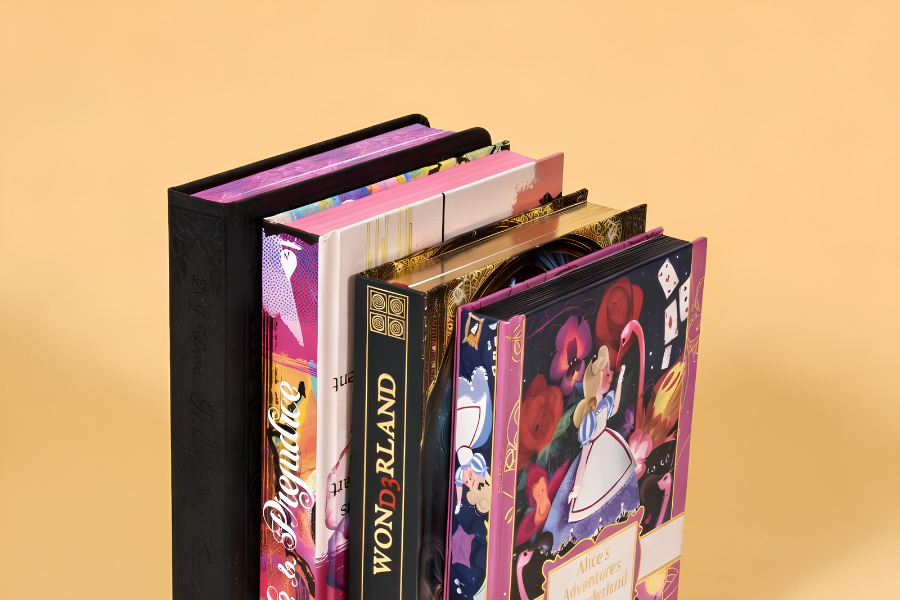
La conception pour l'impression industrielle détermine la réussite ou l'échec d'un cycle de production de livres de coloriage au stade prépresse.. Ignorer la préparation stricte des dossiers entrave toute la chaîne d’approvisionnement, transformer des erreurs de résolution mineures en retards de presse coûteux.
Cette analyse décompose l'architecture de fichiers précise requise pour éliminer les révisions prépresse. Nous évaluons des paramètres critiques tels que l'attribution d'un noir K uniquement à canal unique pour les dessins au trait intérieurs., maintenir des saignements exacts de 0,125 pouce, et exportation de fichiers PDF/X-1a aplatis pour garantir un résultat évolutif sur les presses commerciales.
Présentation des exigences relatives à l'impression du fichier de livre de coloriage
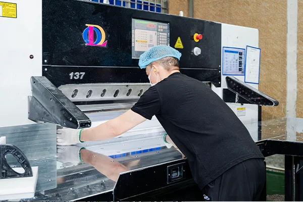
La production industrielle de livres de coloriage exige une préparation stricte des fichiers. Résolution précise, canaux de couleurs spécifiques, et les marges exactes déterminent si un livre s'imprime parfaitement ou échoue sur la presse..
Configuration des fichiers et spécifications graphiques
Une configuration correcte des fichiers élimine les goulots d'étranglement du prépresse. Vous avez besoin de nettoyage, des dessins au trait à contraste élevé qui survivent à la fabrication des plaques et s'impriment de manière nette sur des tirages à grand volume.
- Résolution: Réglez le dessin au trait intérieur sur un minimum de 600 dpi à la taille de coupe finale pour garantir une netteté, contours très contrastés. Conservez les éléments de couverture raster à 300 ppp.
- Canaux de couleur: Configurer les pages intérieures en noir monocanal (K) pour améliorer l'enregistrement de l'impression et éliminer les ombres grises. Enregistrez les profils CMJN uniquement pour les fichiers de couverture.
- Épaisseurs de lignes: Conservez l'épaisseur des lignes entre 0.75 et 1.25 pt pour les conceptions générales. Gardez une course minimale absolue de 0.5 pt pour les pages adultes complexes afin de survivre aux conditions de presse.
- Format de fichier: Exportez tous les livrables sous forme de PDF prêts à imprimer, tel que PDF/X-1a. Incorporez ou délimitez toutes les polices pour empêcher la substitution automatique des polices lors de la fabrication des plaques..
Production physique et disposition des matériaux
Les décisions d'aménagement physique ont un impact direct sur l'utilisateur’l'expérience de coloration. La façon dont vous gérez les marges et les spécifications des matériaux dicte la convivialité et la durabilité du produit final..
- Saignements et zones de sécurité: Appliquez un fond perdu standard de 0,125 pouce sur tous les bords extérieurs. Maintenir une zone de sécurité d'au moins 0.25 pouces à l’intérieur de la ligne de coupe pour empêcher le contenu critique d’être coupé.
- Papier: Spécifiez du papier texte non couché entre 104 et 118 GSM (70-80 kg) pour une utilisation standard avec un crayon. Poussez ceci jusqu'à 160 gsm pour les livres compatibles avec les marqueurs afin de minimiser les fuites d'encre.
- Marges de gouttière: Formatez les fichiers intérieurs avec une marge de gouttière minimale de 0.375 pouces pour les livres de poche parfaitement reliés. Augmentez cette gouttière à 0.5 pouces pour les enfants’s livres pour s'adapter au pliage des pages.
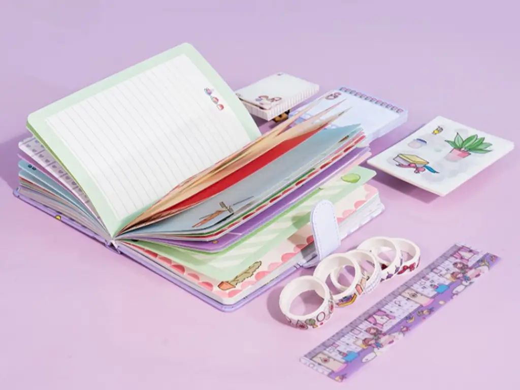
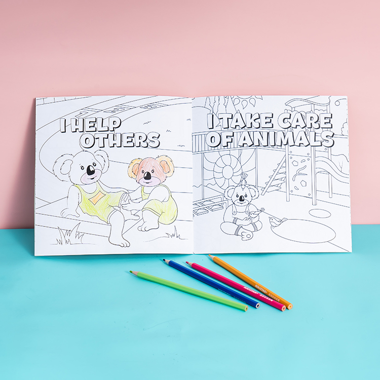
- Reliure et finition: Sélectionnez une reliure à spirale ou à spirale pour permettre aux pages de reposer à plat et de faciliter la coloration.. Ajoutez des lignes de perforation si les utilisateurs s'attendent à déchirer et à afficher l'illustration terminée.
Illustration raster ou vectorielle: Ce qui fonctionne le mieux pour les livres de coloriage?
Les illustrations vectorielles offrent une netteté, lignes infiniment évolutives, parfaites pour l'impression industrielle, tandis que l'art raster nécessite des résolutions massives pour éviter les bords flous et limite la flexibilité du formatage..
Avantages des vecteurs pour la production de livres à colorier
L’impression industrielle de livres de coloriage exige de la précision. Les illustrations vectorielles créent des images à l'aide d'équations mathématiques plutôt que de grilles de pixels fixes, ce qui en fait le format dominant pour les flux de travail prépresse professionnels.
- Mise à l'échelle infinie: Les tracés vectoriels s'adaptent parfaitement à toutes les tailles de livre sans perdre la netteté des bords..
- Précision d'impression: La structure mathématique garantit une netteté, contours noirs cohérents qui se reproduisent proprement sur du papier non couché.
- Contrôle global des coups: Les équipes prépresse peuvent instantanément standardiser les épaisseurs de trait sur des centaines de pages grâce aux ajustements globaux des traits..
- Traitement efficace: La taille des fichiers reste légère, aider les équipements d'impression à traiter rapidement des aménagements intérieurs complexes.
Gestion des illustrations raster dans les flux de travail d'impression
Certains illustrateurs préfèrent dessiner à la main ou peindre numériquement à l'aide d'outils basés sur les pixels.. Bien que commun, les illustrations raster introduisent des contraintes techniques rigides dans le pipeline de production.
- Demandes de résolution: Les illustrations dessinées à la main et numérisées nécessitent 600 à 1200 Résolution dpi à la taille de découpe finale pour éviter une pixellisation irrégulière.
- Verrouillage du format: Les graphiques basés sur les pixels limitent les capacités de redimensionnement, verrouiller les illustrations sur un seul format de livre spécifique.
- Dégradation des bords: Les lignes raster anticrénelées s'impriment souvent avec des bords gris flous, réduisant la clarté globale des lignes sur la presse.
- Solutions hybrides: Les flux de travail hybrides permettent aux illustrateurs de dessiner avec des outils basés sur les pixels avant de convertir l'illustration finale en chemins vectoriels propres pour l'impression..
Augmentez vos marges avec des livres de coloriage personnalisés haut de gamme
Exigences de résolution pour l’impression de livres de coloriage
300 Le DPI à la taille d'impression finale est la référence absolue pour des dessins au trait nets., mais l'utilisation de graphiques vectoriels offre une évolutivité infinie sans pixellisation.
Normes DPI minimales pour les dessins au trait (300 PPP recommandé)
Lors de la préparation de livres à colorier pour les presses industrielles ou les services d'impression à la demande, la clarté des lignes dicte l'expérience utilisateur. Les contours flous gâchent un livre’s valeur perçue. Vous devez verrouiller vos paramètres de résolution avant d'exporter les fichiers finaux vers l'imprimante..
- Oeuvre raster: Définissez les illustrations raster sur 300 DPI à la taille d'impression finale pour garantir une reproduction nette des lignes.
- Scans dessinés à la main: Numérisez les illustrations dessinées à la main au minimum 300 DPI basé sur les dimensions physiques exactes du livre.
- Éléments vectoriels: Utilisez des formats vectoriels pour les logos et la typographie afin que ces éléments évoluent de manière fluide sans perdre en netteté..
- Exportation de fichiers: Exportez des fichiers prêts à imprimer au format PDF avec des polices intégrées pour conserver des bords nets sur toutes les pages.
Erreurs de résolution courantes qui provoquent des lignes floues
Les services prépresse rejettent régulièrement les fichiers en raison d'erreurs de résolution élémentaires.. Les dégâts proviennent généralement de la manière dont les concepteurs gèrent la mise à l'échelle., compression, ou des choix d'épaisseur de ligne dans leurs espaces de travail numériques.
- Mise à l'échelle forcée: Le redimensionnement de petits fichiers raster ou d'images Web pour les adapter à la page entraîne des contours flous et des bords de trait inégaux..
- Traits capillaires: Concevoir avec des traits fins ci-dessous 0.5 les points risquent de briser ou de disparaître les lignes pendant le processus d'impression.
- Compression JPEG: L'enregistrement de dessins au trait avec une compression JPEG importante introduit des artefacts en blocs autour des lignes noires et du texte..
- Ignorer les aperçus avant impression: Sauter le 100% la vérification du zoom sur votre écran masque les problèmes de pixellisation et d'alias qui apparaissent dans le livre imprimé final.
L'examen des fichiers à la taille d'impression réelle évite ces défauts. La détection des baisses de résolution avant de soumettre les fichiers permet de gagner du temps de production et de protéger votre réputation auprès des acheteurs d'impression commerciale..
Saigner, Marges, et zones de sécurité dans les mises en page des livres de coloriage
Définir des saignements précis, marges sûres, et les gouttières protègent votre livre de coloriage contre les erreurs de coupe et la perte de reliure., garantir une production sans faille.
| Élément de mise en page | Ligne directrice standard | Objectif principal |
|---|---|---|
| Zone de fond perdu | 0.125 pouces sur tous les bords extérieurs | Empêche les bords blancs lors des changements de garniture |
| Marge sûre | Minimum 0.125 pouces à l'intérieur de la ligne de coupe | Protège le texte et les détails artistiques critiques |
| Encart de bordure | 0.25 pouces à l'intérieur de la ligne de coupe | Maintient l'uniformité visuelle après la coupe |
| Marge de gouttière | Plus large que la marge extérieure | Empêche la perte d'art dans le pli de la reliure |
Zone de fond perdu pour les conceptions pleine page
Le fond perdu représente la zone au-delà de la ligne de coupe finale où vous étendez intentionnellement votre illustration.. Vous configurez ceci pour empêcher les bords blancs d'apparaître si le papier se déplace pendant le rognage de la production d'impression..
- Bords extérieurs: Ajouter une norme 0.125 pouces (3.175 MM) vers le haut, bas, gauche, et côtés droits d'une page à fond perdu.
- Pages en regard: Ignorez l'ajout de fonds perdus dans les marges intérieures, sauf si vous formatez le fichier comme une seule planche continue..
- Art bord à bord: Forcez vos arrière-plans et vos illustrations pleine page à atteindre complètement la limite extérieure du fond perdu pour éviter les fines bordures blanches..
Des marges sûres pour éviter les problèmes de coupe
Les marges de sécurité agissent comme un tampon interne entre votre contenu important et la ligne de coupe finale. Cette zone désignée protège le texte, numéros de pages, éléments de titre, et les principaux détails de l'illustration de la dérive de la fraise.
Pour organiser votre contenu avec précision, définissez d'abord vos guides de mise en page pour la ligne de coupe, puis établissez vos guides de zone de sécurité à l'intérieur d'eux. Gardez les petites légendes, instructions, et des détails artistiques complexes strictement à l'intérieur de cette limite intérieure.
- Contenu critique: Positionner les éléments essentiels au minimum 0.125 pouces à l'intérieur de la ligne de coupe.
- Visuels de bordure: Appliquez une marge de sécurité de 0,25 pouce pour les bordures dessinées afin de maintenir l'uniformité visuelle une fois que le coupeur commercial a effectué la tranche finale..
Sécurité des gouttières pour l'alignement des fixations
La gouttière représente la marge intérieure la plus proche de la reliure physique du livre.. Des marges de gouttière appropriées empêchent vos illustrations et votre texte de disparaître dans la zone du pli ou du dos..
Les livres de coloriage reliés exigent une marge intérieure nettement plus large que la marge extérieure pour compenser la courbure de la page.. Vous devez conserver les dessins au trait essentiels confortablement à l'intérieur de cette zone sécurisée pour les gouttières afin que les utilisateurs puissent colorier les pages facilement sans casser le dos..
- Placement focal: Décaler les visages, mains, étiquettes de texte, et d'autres détails clés éloignés du bord de la reliure.
- Diffusion de l'art: Appliquer des ajustements structurels spécifiques aux mises en page basées sur des planches si une illustration continue traverse le pli central.
Mode couleur et qualité de ligne: RVB vs CMJN pour l'impression
L'impression commerciale nécessite un formatage CMJN et des paramètres de noir K uniquement pour garantir des dessins au trait nets et une reproduction prévisible des couleurs sur la presse..
Pourquoi le CMJN est requis pour l'impression commerciale
Les écrans et le papier gèrent la couleur de manières complètement différentes. Les écrans RVB reposent sur l’émission de lumière, tandis que CMJN utilise des pigments physiques ou des toners pour absorber et refléter la lumière ambiante. Cette réalité physique dicte le fonctionnement des équipements d’impression industrielle.
- Encres de traitement: Compensation commerciale, flexographie, et les presses numériques à grand volume appliquent physiquement des encres quadrichromiques (Cyan, Magenta, Jaune, et noir) au papier.
- Normes d'étalonnage: Opérateurs de presses industrielles et processeurs d'images raster (RIP) calibrez la densité de l'encre et l'engraissement des points strictement en utilisant des cibles de référence CMJN.
- Correspondance de marque: Les presses numériques modernes nécessitent toujours un espace de travail CMJN défini pour garantir des tons directs prévisibles et une correspondance précise avec la marque..
Comment les fichiers RVB affectent la sortie d'impression finale
L'envoi de fichiers RVB à une imprimante commerciale oblige le système à faire des suppositions éclairées. Les imprimantes ou les RIP convertissent automatiquement les fichiers RVB soumis en CMJN, provoquant des changements de couleur imprévisibles lorsque le logiciel applique ses propres profils par défaut.
- Compression de gamme: RVB offre une gamme plus large. Les couleurs très saturées comme les verts néon ou les cyans brillants se compriment et perdent de leur éclat lorsqu'elles sont forcées dans l'espace CMJN..
- Limites de la lumière réfléchie: Images de rétroéclairage des écrans, les rendant intrinsèquement plus brillants et plus saturés que le produit imprimé final vu sous la lumière ambiante réfléchie.
- Risques d’alignement: Laisser du texte fin ou des dessins au trait en RVB oblige le RIP à le convertir en un noir riche en quatre couleurs, créant de graves risques d'enregistrement sur la presse.
K-Only Black pour des lignes de coloration nettes
L'impression de contours nets nécessite un contrôle strict de la plaque noire. Attribution du noir K uniquement (C=0, M=0, Oui=0, K=100) force tous les travaux de lignes complexes et la typographie fine sur une seule plaque d'impression, éviter les effets de flou des couleurs mélangées.
- Inscription sans faille: Le noir à plaque unique élimine les franges de couleur et les bords flous causés par un mauvais repérage microscopique entre le cyan, magenta, et plaques jaunes.
- Application ciblée: Le noir riche fonctionne bien pour les, fonds solides mais gâche la netteté des dessins techniques ou des lignes de livres à colorier.
- Stabilité de la surimpression: L'application des paramètres de surimpression aux lignes noires K uniquement garantit qu'elles s'impriment directement sur les couleurs sous-jacentes sans laisser d'espaces blancs indésirables..
Normes de fichiers PDF pour la production de livres à colorier
Pourquoi PDF/X-1a est la norme de l'industrie
PDF/X-1a agit comme un strict, Modèle normalisé ISO qui garantit une fiabilité prête à l'impression. Il force toutes les données de couleur en CMJN ou en tons directs et supprime de manière agressive les éléments RVB en direct..
Ce format prend directement en charge la production de livres de coloriage en grand volume sur les presses offset et numériques modernes.. En verrouillant des variables spécifiques, PDF/X-1a évite les décalages de gris et les problèmes de densité des lignes qui gâchent fréquemment les intérieurs en noir et blanc.
La norme offre plusieurs avantages critiques en matière de production:
- Intégrité du dessin au trait: L'élimination complète de la transparence en direct garantit la propreté des processus des opérateurs prépresse et du logiciel RIP., noir uni (100% K) dessin au trait sans artefacts de halo imprévisibles ni contours manquants.
- Gestion de l'encre: Le format contrôle la couverture totale de la zone (TAC) sur la pochette. Cela évite les zones sur-encrées qui déclenchent des retards de séchage ou des maculages lors de tirages à grande échelle..
- Efficacité du flux de travail: La normalisation sur PDF/X-1a rationalise le 2026 chaîne d'approvisionnement en impression. Il permet aux illustrateurs indépendants, emballeurs, et les fournisseurs d'impression offshore pour échanger des fichiers directement sans erreurs de compatibilité spécifiques aux logiciels.
Exigences en matière d'intégration de polices et d'aplatissement de fichiers
Les flux de travail d'impression industrielle exigent que les concepteurs intègrent toutes les polices directement dans le PDF final.. Cette étape élimine toute dépendance à l’égard de l’installation d’impression’s polices du système local.
L'intégration de polices sous licence commerciale empêche la substitution de secours au stade RIP. Vous arrêtez les changements brusques de largeur des lettres, texte de coupure près de la ligne de coupe, et des détails de la colonne vertébrale mal alignés avant qu'ils ne surviennent.
Les équipes de production gèrent le texte en utilisant deux stratégies distinctes:
- Illustration de couverture: Les opérateurs prépresse présentent souvent le texte de couverture comme une mesure de sécurité supplémentaire contre la substitution de polices..
- Pages intérieures: Conserver le droit d'auteur et le texte des légendes sous forme de polices dynamiques intégrées permet de maintenir une taille de fichier gérable sur des centaines de pages..
Les fichiers prêts à être imprimés doivent présenter une transparence entièrement aplatie. Vous devez résoudre les ombres portées, brille, et superposez les modes de fusion en objets vectoriels opaques ou en segments pixellisés de manière appropriée avant d'envoyer le fichier à l'imprimante..
Les directives prépresse exigent également la livraison de fichiers en une seule couche. Les créateurs doivent supprimer toutes les couches de guidage, références de croquis originaux, et des modèles de langues alternatives avant d'exporter la version plate finale.
Pendant le processus d'aplatissement, les opérateurs prépresse configurent la résolution sur au moins 300 à 600 dpi pour la rastérisation nécessaire. Ils équilibrent ce seuil de résolution tout en garantissant que les dessins au trait intérieurs critiques restent nets., données vectorielles sans alias.
Différences de préparation des dossiers de couverture et intérieurs
L'impression industrielle traite les couvertures et les intérieurs comme des composants de fabrication distincts. Les couvertures exigent des fonds perdus importants et des spécifications CMJN, tandis que les intérieurs reposent sur des marges strictes et 100% Dessin au trait K.
Exigences de conception de couverture (Couleur, Saigner, Effets de finition)
Les couvertures de livres fonctionnent comme un seul fichier enveloppant contenant le dos, colonne vertébrale, et panneaux avant. Vous devez calculer la largeur exacte du dos en fonction du nombre final de pages et du papier.’s pages par pouce (IPP) notation.
Les imprimantes industrielles nécessitent des fonds perdus spécifiques pour envelopper correctement le matériau de couverture.:
- Couvertures souples: Appliquer un fond perdu standard de 0,125 pouce sur les bords extérieurs.
- Reliés: Nécessite jusqu'à 0,75 pouce de fond perdu pour envelopper le panneau de reliure.
- Zones de sécurité: Conservez le texte et les logos essentiels strictement à l'intérieur des zones de garniture et de charnière..
Définissez toutes les illustrations de couverture sur l'espace colorimétrique CMJN à un minimum de 300 PPP. Évitez de faire correspondre des couleurs unies continues sur la couverture et les pages intérieures.. Les différences de couchage du papier et d'absorption de l'encre rendent la correspondance exacte des couleurs très imprévisible sur ces substrats distincts..
Si votre couverture comprend des finitions spécialisées, fourniture séparée 100% plaques de vecteur noir. Fournir des fichiers dédiés au spot UV, estampage à chaud, ou gaufrage. Assurez-vous que tous les petits détails s'adaptent aux tolérances de fabrication et à la flexion de la planche afin que les effets de finition s'alignent parfaitement sur la presse..
Configuration de la page intérieure pour la cohérence des dessins au trait
Exportez le bloc de texte intérieur sous la forme d'un seul PDF multipage dans l'ordre de lecture exact. La taille de découpe du document doit correspondre précisément aux dimensions définies dans le modèle de couverture correspondant.
Vous devez tenir compte du fluage de la reliure et de la structure physique du livre en utilisant des marges asymétriques.:
- À l'intérieur de la gouttière: Définissez une marge intérieure plus large de 0.75 à 1 pouce pour que le contenu ne soit pas avalé par la reliure.
- Sécurité du pliage central: Empêchez les diagrammes et les illustrations critiques de traverser le pli central.
Créez des illustrations en utilisant des formats vectoriels autant que possible. Si vous comptez sur des dessins au trait raster, exporter au minimum 600 DPI pour garantir des bords nets. Formatez tous les éléments noirs comme 100% K (noir monocanal) plutôt que CMJN composite pour éviter les contours flous causés par les changements de repérage des couleurs sur l'équipement de la presse.
Standardisez l'épaisseur de vos lignes à au moins 0.25 points afin qu'ils s'impriment clairement et ne tombent pas pendant le processus d'offset. Utilisez des pages maîtres dans votre logiciel de mise en page pour verrouiller des légendes uniformes, titres, et des polices entièrement intégrées dans tout le livre.
Pourquoi les épreuves physiques et les maquettes sont essentielles avant la production de masse
Les preuves physiques servent de vérification finale de la réalité. Ils exposent les changements de couleur, défauts structurels, et le fluage contraignant que les écrans cachent, prévenir les catastrophes coûteuses liées à la production de masse.
Vérification de la précision des couleurs et de la netteté des lignes
Les moniteurs affichent une lumière RVB additive, mais la production de masse repose entièrement sur des encres CMJN soustractives. Les épreuves physiques révèlent exactement comment des substrats spécifiques absorbent l'encre. Ils montrent la vraie saturation des couleurs, gain de points, et des effets de séchage que les écrans numériques manquent complètement.
Les tests dans des conditions de production réelles valident vos profils de presse et vos limites d'encre pour différentes technologies d'impression.. Cette étape garantit que votre balance des gris neutre reste stable et que votre résultat final correspond exactement aux cibles de couleur de la marque..
Les échantillons physiques donnent aux équipes prépresse la possibilité d'inspecter la définition des bords d'un texte fin. Vous pouvez vérifier physiquement l'exactitude de l'enregistrement des éléments critiques tels que les codes-barres et confirmer que les surimpressions et les découpages complexes fonctionnent exactement comme prévu sur la presse..
Vérification de la reliure et de la mise en page
Les maquettes physiques confirment que la salle de presse assemble les sections et les signatures dans le bon ordre. Ils fournissent un aperçu tangible de la quantité exacte de contenu visuel qui disparaît dans le dos lorsqu'il s'agit d'une reliure parfaite ou d'une casse..
À mesure que le nombre de pages augmente, les pages extérieures poussent naturellement vers l’extérieur. Construire un mannequin physique vérifie que votre compensation de fluage prépresse fonctionne réellement. Cela permet de conserver tous les textes critiques en toute sécurité dans les marges une fois que le coupeur a effectué le découpage final..
Tester les plis physiques, tels que des gatefolds ou des tip-ins, garantit le bon déroulement des structures complexes. Une maquette appropriée prouve que ces fonctionnalités ne masqueront pas les informations clés et offriront une expérience fiable à l'utilisateur final..
Pensées finales
Ignorer la préparation appropriée des fichiers peut permettre d'économiser quelques heures de temps de conception, mais cela entraîne inévitablement des pertes financières catastrophiques sur l'imprimerie. Appliquer des normes PDF/X-1a strictes et 100% Le dessin au trait K est le seul moyen fiable de protéger votre budget de production contre les impressions floues et les échecs d'alignement des reliures.. La précision au niveau numérique garantit un inventaire physique impeccable qui commande des prix de détail élevés..
Arrêtez de laisser vos tirages à gros volumes au hasard. Nous vous recommandons d'obtenir une épreuve physique pour valider vos profils de couleurs, marges, et des choix contraignants avant de s'engager dans une production de masse. Contactez notre équipe prépresse pour revoir vos dossiers et verrouiller votre stratégie de fabrication.
Foire aux questions
Quelle résolution doit avoir mon livre de coloriage?
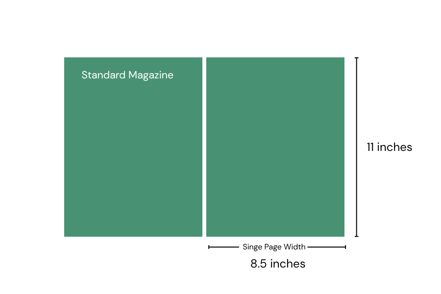
Vous devez définir vos pages à colorier intérieures sur un minimum de 300 DPI à la taille d'impression finale. Pour une norme 8.5 x page de 11 pouces, cela se traduit par 2550 x 3300 pixels. Si vous scannez des œuvres d'art dessinées à la main, capturez-le à 600 DPI pour garder les lignes nettes, puis sous-échantillonner pour 300 DPI pour le fichier d'impression. Les images de couverture ont besoin 300 DPI également. Pour le texte et les logos, s'en tenir aux formats vectoriels comme PDF ou SVG car ils évoluent parfaitement sans pixellisation.
Comment configurer les saignements pour un 8.5 x livre de coloriage de 11 pouces?
Ajoutez un fond perdu de 0,125 pouce sur les quatre côtés de votre page pour imprimer des motifs bord à bord sans laisser de bordures blanches.. Pour un 8.5 x livre de 11 pouces, définissez le canevas de votre document sur 8.75 x 11.25 pouces. Tirez complètement tous les éléments d'arrière-plan vers ce bord extérieur. Conservez les dessins au trait et le texte essentiels à l'intérieur de la zone de sécurité, au moins 0.375 pouces à l'intérieur de la ligne de coupe finale - afin que le coupeur industriel ne les coupe pas.
Dois-je utiliser RVB ou CMJN pour les dessins au trait d'un livre de coloriage?
Vous pouvez dessiner et éditer en RVB pour utiliser un, flux de travail numérique plus fluide. Lorsque vous préparez le fichier d'impression final, vérifiez votre imprimante’spécifications. Les plateformes d'impression à la demande acceptent souvent les fichiers RVB et les convertissent automatiquement. Convertir vous-même votre fichier final en CMJN garantit les résultats les plus prévisibles sur papier. Pour les pages intérieures en noir et blanc, privilégier le contraste élevé, des lignes noires pleines insistent sur le mode de couleur exact.
Quel est le meilleur format de fichier pour l'impression professionnelle?
Exportez votre livre de coloriage final au format PDF haute résolution. Les imprimeurs commerciaux et les services d'impression à la demande acceptent universellement les fichiers PDF car ils verrouillent votre mise en page., polices, et les chemins vectoriels parfaitement. Sélectionnez le préréglage PDF/X si votre logiciel le propose; l'industrie de l'imprimerie a construit cette norme spécifiquement pour éliminer les erreurs de prépresse. Réservez les formats TIFF uniquement pour les applications autonomes, images de couverture photographiques ou raster haute résolution.
Comment éviter que l'art ne se perde dans le livre’s contraignant?
La reliure industrielle colle les pages au dos et enfonce profondément les bords intérieurs dans la gouttière.. Gardez les visages des personnages, texte, et les détails critiques entièrement hors de cette marge intérieure. Réglez votre zone de sécurité intérieure sur au moins 0.6 à 0.8 pouces. Si une illustration s’étend sur deux pages, placer uniquement des éléments d'arrière-plan peu détaillés au centre 0.3 pouces. Le pli physique masquera ou déformera inévitablement cette section médiane.
Pourquoi mes lignes noires paraissent-elles grises après l'impression?
Les lignes noires s'impriment souvent en gris lorsque le logiciel de mise en page convertit les noirs RVB riches en un mélange CMJN boueux. Définissez votre dessin au trait intérieur comme 100% K (noir monocanal) pour garantir la solidité, contours très contrastés. Aussi, vérifiez l'épaisseur de votre trait. Lignes plus fines que 0.5 les points se séparent en points demi-teintes sur la presse, créer un faible, aspect gris. Enfin, vérifiez votre pilote d'imprimante et désactivez tout brouillon ou mode éco avant d'exporter.