


Designing for Industrial Print dictates whether a coloring book production run succeeds or fails at the prepress stage. Ignoring strict file preparation bottlenecks the entire supply chain, turning minor resolution errors into expensive press delays.
This analysis breaks down the precise file architecture required to eliminate prepress revisions. We evaluate critical parameters like assigning single-channel K-only black for interior line art, maintaining exact 0.125-inch bleeds, and exporting flattened PDF/X-1a files to secure a scalable result on commercial presses.
Coloring Book File Print-Ready Requirements Overview
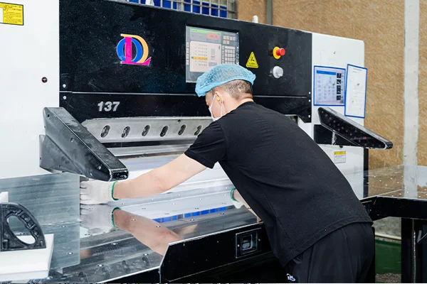
Industrial coloring book production demands strict file preparation. Precise resolution, specific color channels, and exact margins dictate whether a book prints flawlessly or fails on the press.
File Setup and Graphic Specifications
Getting the file setup right eliminates prepress bottlenecks. You need clean, high-contrast line art that survives plate making and prints sharply across high-volume runs.
- Resolution: Set interior line art to a minimum of 600 dpi at the final trim size to ensure crisp, high-contrast outlines. Keep raster cover elements at 300 dpi.
- Color Channels: Configure interior pages as single-channel black (K) to improve print registration and eliminate gray shadows. Save CMYK profiles strictly for the cover files.
- Line Weights: Maintain line weights between 0.75 and 1.25 pt for general designs. Keep an absolute minimum stroke of 0.5 pt for intricate adult pages to survive press conditions.
- File Format: Export all deliverables as print-ready PDFs, such as PDF/X-1a. Embed or outline all fonts to prevent automated font substitution during plate making.
Physical Production and Material Layout
Physical layout decisions directly impact the user’s coloring experience. The way you handle margins and material specs dictates the usability and durability of the final product.
- Bleeds and Safe Zones: Apply a standard 0.125-inch bleed on all outer edges. Maintain a safe area of at least 0.25 inches inside the trim line to protect critical content from being trimmed.
- Paper Stock: Specify uncoated text paper between 104 and 118 gsm (70-80 lb) for standard pencil use. Push this up to 160 gsm for marker-friendly books to minimize ink bleed-through.
- Gutter Margins: Format interior files with a minimum gutter margin of 0.375 inches for perfect-bound paperbacks. Increase this gutter to 0.5 inches for children’s books to accommodate page bending.
- Binding and Finishing: Select spiral or coil binding to allow pages to lay flat for easier coloring. Add perforation lines if users expect to tear out and display the finished artwork.
Raster vs Vector Artwork: What Works Best for Coloring Books?
Vector artwork delivers crisp, infinitely scalable lines perfect for industrial print, while raster art requires massive resolutions to prevent fuzzy edges and limits formatting flexibility.
Vector Advantages for Coloring Book Production
Industrial coloring book printing demands precision. Vector artwork builds images using mathematical equations rather than fixed pixel grids, making it the dominant format for professional prepress workflows.
- Infinite scaling: Vector paths scale perfectly across any book trim size without losing edge sharpness.
- Print precision: The mathematical structure ensures crisp, consistent black outlines that reproduce cleanly on uncoated paper stocks.
- Global stroke control: Prepress teams can instantly standardize line weights across hundreds of pages using global stroke adjustments.
- Efficient processing: File sizes remain lightweight, helping printing equipment process complex interior layouts quickly.
Managing Raster Artwork in Print Workflows
Some illustrators prefer to sketch by hand or paint digitally using pixel-based tools. While common, raster artwork introduces rigid technical constraints into the production pipeline.
- Resolution demands: Hand-drawn and scanned artwork requires 600 to 1200 dpi resolution at the final trim size to avoid jagged pixelation.
- Format lock-in: Pixel-based graphics restrict resizing capabilities, locking illustrations to a single specific book format.
- Edge degradation: Anti-aliased raster lines often print with fuzzy gray edges, reducing overall line clarity on the press.
- Hybrid solutions: Hybrid workflows let illustrators sketch in pixel-based tools before converting the final art into clean vector paths for print.
Boost Margins With Premium Custom Coloring Books
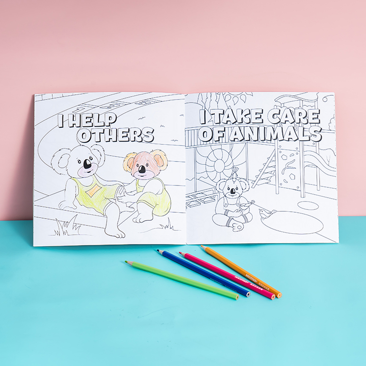
Resolution Requirements for Coloring Book Printing
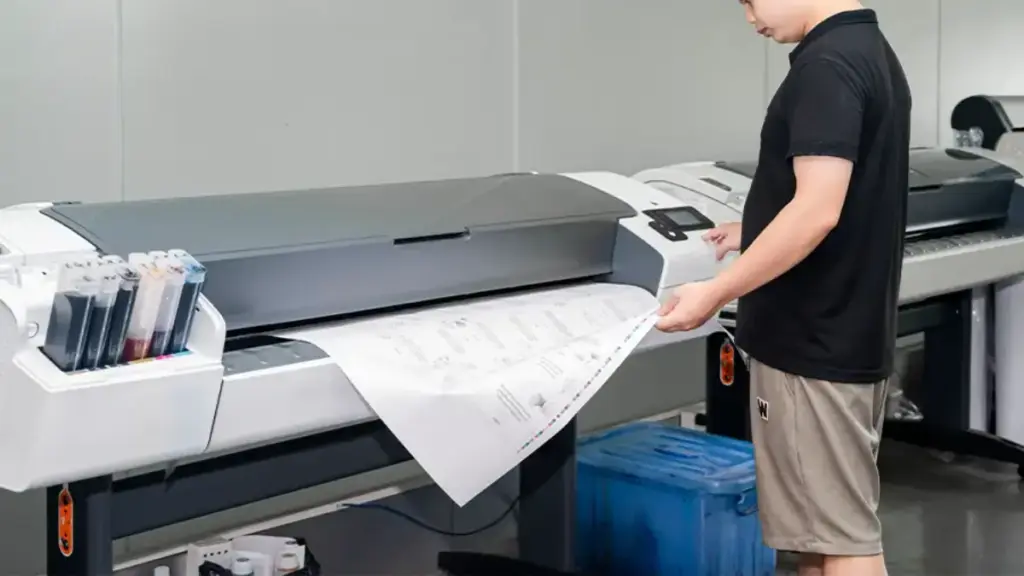
300 DPI at final print size is the absolute baseline for crisp line art, but using vector graphics provides infinite scalability without pixelation.
Minimum DPI Standards for Line Art (300 DPI Recommended)
When prepping coloring books for industrial presses or print-on-demand services, line clarity dictates the user experience. Blurry outlines ruin a book’s perceived value. You must lock in your resolution parameters before exporting any final files to the printer.
- Raster Artwork: Set raster artwork to 300 DPI at the final print size to ensure clean line reproduction.
- Hand-Drawn Scans: Scan hand-drawn illustrations at a minimum of 300 DPI based on the exact physical dimensions of the book.
- Vector Elements: Use vector formats for logos and typography so these elements scale smoothly without losing sharpness.
- File Export: Export print-ready files as PDFs with embedded fonts to maintain crisp edges across all pages.
Common Resolution Mistakes That Cause Blurry Lines
Prepress departments routinely reject files for basic resolution errors. The damage usually stems from how designers handle upscaling, compression, or line weight choices inside their digital workspaces.
- Forced Upscaling: Resizing small raster files or web images to fit the page causes fuzzy outlines and uneven stroke edges.
- Hairline Strokes: Designing with hairline strokes below 0.5 points risks lines breaking up or disappearing during the print process.
- JPEG Compression: Saving line art with heavy JPEG compression introduces blocky artifacts around black lines and text.
- Skipping Print Previews: Skipping the 100% zoom check on your screen hides pixelation and aliasing issues that appear in the final printed book.
Reviewing files at actual print size prevents these defects. Catching resolution drops before submitting files saves production time and protects your reputation with commercial print buyers.
Bleed, Margins, and Safe Zones in Coloring Book Layouts
Setting exact bleeds, safe margins, and gutters protects your coloring book art from trimming errors and binding loss, ensuring a flawless production run.
| Layout Element | Standard Guideline | Primary Purpose |
|---|---|---|
| Bleed Area | 0.125 inches on all outer edges | Prevents white edges during trim shifts |
| Safe Margin | Minimum 0.125 inches inside trim line | Protects text and critical art details |
| Border Inset | 0.25 inches inside trim line | Maintains visual evenness after cutting |
| Gutter Margin | Wider than outer margin | Prevents art loss in the binding fold |
Bleed Area for Full-Page Designs
Bleed represents the area beyond the final trim line where you intentionally extend your artwork. You set this up to prevent white edges from showing if the paper shifts during print production trimming.
- Outer Edges: Add a standard 0.125 inches (3.175 mm) to the top, bottom, left, and right sides of a full-bleed page.
- Facing Pages: Skip adding bleed to the inner margins unless you format the file as a single continuous spread.
- Edge-to-Edge Art: Force your backgrounds and full-page illustrations to reach the outer bleed boundary completely to avoid thin white borders.
Safe Margins to Avoid Cutting Issues
Safe margins act as an internal buffer between your important content and the final trim line. This designated zone protects text, page numbers, title elements, and key illustration details from cutter drift.
To organize your content accurately, set your layout guides for the trim line first, then establish your safe zone guides inside them. Keep small captions, instructions, and intricate art details strictly within this inner boundary.
- Critical Content: Position essential elements at least 0.125 inches inside the trim line.
- Border Visuals: Apply a 0.25-inch safe margin for drawn borders to maintain visual evenness after the commercial cutter makes the final slice.
Gutter Safety for Binding Alignment
The gutter represents the inner margin sitting nearest to the physical book binding. Proper gutter margins keep your artwork and text from disappearing into the fold or spine area.
Bound coloring books demand an inner margin significantly wider than the outer margin to compensate for page curvature. You must keep essential line art comfortably inside this gutter-safe zone so users can color the pages easily without breaking the spine.
- Focal Placement: Shift faces, hands, text labels, and other key details away from the binding edge.
- Spread Art: Apply specific structural adjustments to spread-based layouts if continuous artwork crosses the center fold.
Color Mode and Line Quality: RGB vs CMYK for Printing
Commercial printing requires CMYK formatting and K-only black settings to guarantee sharp line art and predictable color reproduction on the press.
Why CMYK Is Required for Commercial Printing
Screens and paper handle color in completely different ways. RGB displays rely on emitting light, while CMYK uses physical pigments or toners to absorb and reflect ambient light. This physical reality dictates how industrial printing equipment operates.
- Process Inks: Commercial offset, flexo, and high-volume digital presses physically apply four-color process inks (Cyan, Magenta, Yellow, and Black) to the paper.
- Calibration Standards: Industrial press operators and raster image processors (RIPs) calibrate ink density and dot gain strictly using CMYK reference targets.
- Brand Matching: Modern digital presses still require a defined CMYK working space to ensure predictable spot colors and accurate brand matching.
How RGB Files Affect Final Print Output
Sending RGB files to a commercial printer forces the system to make educated guesses. Printers or RIPs automatically convert submitted RGB files into CMYK, causing unpredictable color shifts when the software applies its own default profiles.
- Gamut Compression: RGB features a wider gamut. Highly saturated colors like neon greens or bright cyans compress and lose vibrancy when forced into the CMYK space.
- Reflected Light Limitations: Screens backlight images, making them appear inherently brighter and more saturated than the final printed product viewed under reflected ambient light.
- Alignment Risks: Leaving fine text or line art in RGB forces the RIP to convert it into a four-color rich black, creating severe registration risks on the press.
K-Only Black for Crisp Coloring Lines
Printing crisp outlines requires tight control over the black plate. Assigning K-only black (C=0, M=0, Y=0, K=100) forces all intricate line work and fine typography onto a single printing plate, avoiding the blurring effects of mixed colors.
- Flawless Registration: Single-plate black eliminates the color fringing and fuzzy edges caused by microscopic misregistration between cyan, magenta, and yellow plates.
- Targeted Application: Rich black works well for deep, solid backgrounds but ruins the sharpness of technical drawings or coloring book lines.
- Overprint Stability: Applying overprint settings to K-only black lines ensures they print directly on top of underlying colors without leaving unwanted white gaps.
PDF File Standards for Coloring Book Production
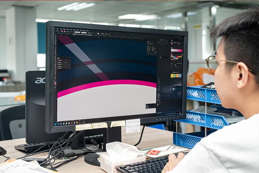
Why PDF/X-1a Is the Industry Standard
PDF/X-1a acts as a strict, ISO-standardized blueprint that guarantees press-ready reliability. It forces all color data into CMYK or spot colors and aggressively strips out live RGB elements.
This format directly supports high-volume coloring book production across modern offset and digital presses. By locking down specific variables, PDF/X-1a prevents the gray shifts and line density issues that frequently ruin black-and-white interiors.
The standard delivers several critical production advantages:
- Line Art Integrity: Eliminating live transparency entirely ensures prepress operators and RIP software process clean, solid black (100% K) line art without unpredictable halo artifacts or missing outlines.
- Ink Management: The format controls Total Area Coverage (TAC) on cover artwork. This prevents over-inked areas that trigger drying delays or set-off during large-scale print runs.
- Workflow Efficiency: Standardizing on PDF/X-1a streamlines the 2026 print supply chain. It allows freelance illustrators, packagers, and offshore print vendors to exchange files directly without software-specific compatibility errors.
Font Embedding and File Flattening Requirements
Industrial print workflows require designers to embed all fonts directly into the final PDF. This step eliminates any dependency on the print facility’s local system fonts.
Embedding commercially licensed fonts prevents fallback substitution at the RIP stage. You stop sudden shifts in letter width, cut-off text near the trim line, and misaligned spine details before they happen.
Production teams manage text using two distinct strategies:
- Cover Artwork: Prepress operators often outline cover text as an extra security measure against font substitution.
- Interior Pages: Keeping copyright and caption text as embedded live fonts helps maintain a manageable file size across hundreds of pages.
Press-ready files must feature fully flattened transparency. You must resolve drop shadows, glows, and layer blending modes into opaque vector objects or appropriately rasterized segments before sending the file to the printer.
Prepress guidelines also demand single-layer file delivery. Creators must remove all guide layers, original sketch references, and alternate language templates prior to exporting the final flat version.
During the flattening process, prepress operators configure the resolution to at least 300 to 600 dpi for necessary rasterization. They balance this resolution threshold while ensuring critical interior line art remains crisp, un-aliased vector data.
Cover vs Interior File Preparation Differences
Industrial printing treats covers and interiors as distinct manufacturing components. Covers demand heavy bleeds and CMYK specs, while interiors rely on strict margins and 100% K line art.
Cover Design Requirements (Color, Bleed, Finishing Effects)
Book covers operate as a single wraparound file containing the back, spine, and front panels. You must calculate the exact spine width based on the final page count and the paper’s pages per inch (PPI) rating.
Industrial printers require specific bleed allowances to wrap the cover material properly:
- Softcovers: Apply a standard 0.125-inch bleed to the outer edges.
- Hardcovers: Require up to a 0.75-inch bleed to wrap around the binding board.
- Safe Zones: Keep essential text and logos strictly inside the trim and hinge zones.
Set all cover artwork to the CMYK color space at a minimum of 300 DPI. Avoid matching continuous solid colors across the cover and the interior pages. Differences in paper coating and ink absorption make exact color matching highly unpredictable across these separate substrates.
If your cover includes specialty finishes, supply separate 100% black vector plates. Provide dedicated files for spot UV, foil stamping, or embossing. Ensure all fine details accommodate manufacturing tolerances and board flex so the finishing effects align perfectly on the press.
Interior Page Setup for Line Art Consistency
Export the interior text block as a single multi-page PDF in exact reading order. The document trim size must precisely match the dimensions defined in the corresponding cover template.
You must account for binding creep and physical book structure using asymmetric margins:
- Inside Gutter: Set a wider inside margin of 0.75 to 1 inch so content does not get swallowed by the binding.
- Center Fold Safety: Keep critical diagrams and illustrations from crossing the center fold.
Build illustrations using vector formats whenever possible. If you rely on raster line art, export at a minimum of 600 DPI to guarantee crisp edges. Format all black elements as 100% K (single-channel black) rather than composite CMYK to prevent blurry outlines caused by color registration shifts on the press equipment.
Standardize your line weights to at least 0.25 points so they print clearly and do not drop out during the offset process. Use master pages in your layout software to lock in uniform captions, headings, and fully embedded fonts throughout the entire book.
Why Physical Proofs and Mock-Ups Are Essential Before Mass Production
Physical proofs act as your final reality check. They expose color shifts, structural flaws, and binding creep that screens hide, preventing expensive mass-production disasters.
Checking Color Accuracy and Line Sharpness
Monitors display additive RGB light, but mass production relies entirely on subtractive CMYK inks. Physical proofs reveal exactly how specific substrates absorb ink. They show the real color saturation, dot gain, and dry-back effects that digital screens completely miss.
Testing under actual production conditions validates your press profiles and ink limits across different printing technologies. This step ensures your neutral gray balance holds steady and your final output matches exact brand color targets.
Physical samples give prepress teams the ability to inspect the edge definition of fine text. You can physically check the registration accuracy for critical elements like barcodes and confirm that complex overprints and knockouts perform exactly as designed on the press.
Verifying Binding and Page Layout
Physical mock-ups confirm that the press room assembles sections and signatures in the correct sequence. They provide a tangible look at exactly how much visual content disappears into the spine when dealing with perfect or case binding.
As page counts grow, outer pages naturally push outward. Building a physical dummy verifies that your prepress creep compensation actually works. This keeps all critical text safely inside the margins after the cutter makes the final trim.
Testing physical folds, such as gatefolds or tip-ins, guarantees that complex structures handle smoothly. A proper mock-up proves these features will not obscure key information and will deliver a reliable experience for the end user.
Final Thoughts
Skipping proper file preparation might save a few hours of design time, but it inevitably leads to catastrophic financial losses on the printing press. Enforcing strict PDF/X-1a standards and 100% K line art is the only reliable way to safeguard your production budget against blurry prints and binding alignment failures. Precision at the digital stage guarantees flawless physical inventory that commands premium retail pricing.
Stop leaving your high-volume print runs to chance. We recommend securing a physical proof to validate your color profiles, margins, and binding choices before committing to mass production. Contact our prepress team to review your files and lock in your manufacturing strategy.
Frequently Asked Questions
What resolution should my coloring book art be?
You must set your interior coloring pages to a minimum of 300 DPI at the final print size. For a standard 8.5 x 11-inch page, this translates to 2550 x 3300 pixels. If you scan hand-drawn art, capture it at 600 DPI to keep lines crisp, then downsample to 300 DPI for the print file. Cover images need 300 DPI as well. For text and logos, stick to vector formats like PDF or SVG since they scale perfectly without pixelating.
How do I set up bleeds for an 8.5 x 11-inch coloring book?
Add a 0.125-inch bleed to all four sides of your page to print edge-to-edge designs without leaving white borders. For an 8.5 x 11-inch book, set your document canvas to 8.75 x 11.25 inches. Pull all background elements completely out to this outer edge. Keep essential line art and text inside the safe zone—at least 0.375 inches inside the final trim line—so the industrial cutter does not clip them.
Should I use RGB or CMYK for coloring book line art?
You can draw and edit in RGB to utilize a faster, smoother digital workflow. When you prepare the final print file, verify your printer’s specifications. Print-on-demand platforms often accept RGB files and convert them automatically. Converting your final file to CMYK yourself guarantees the most predictable results on paper. For interior black-and-white pages, prioritize high-contrast, solid black lines over stressing about the exact color mode.
What is the best file format for professional printing?
Export your final coloring book as a high-resolution PDF. Commercial printers and print-on-demand services universally accept PDFs because they lock in your layout, fonts, and vector paths perfectly. Select the PDF/X preset if your software offers it; the print industry built this standard specifically to eliminate prepress errors. Reserve TIFF formats strictly for standalone, high-resolution photographic or raster cover images.
How do I avoid art getting lost in the book’s binding?
Industrial binding glues pages at the spine and pulls the inner edges deep into the gutter. Keep character faces, text, and critical details entirely out of this inner margin. Set your inside safe zone to at least 0.6 to 0.8 inches. If an illustration spans a two-page spread, put only low-detail background elements in the center 0.3 inches. The physical fold will inevitably hide or distort that middle section.
Why do my black lines look gray after printing?
Black lines often print gray when layout software converts rich RGB blacks into a muddy CMYK mix. Define your interior line art as 100% K (single-channel black) to guarantee solid, high-contrast outlines. Also, verify your line thickness. Lines thinner than 0.5 points break apart into halftone dots on the press, creating a weak, gray appearance. Finally, check your print driver and disable any draft or eco-modes before exporting.